Case study for craigslist resume vertical
Digital Product Design, UX+UI
Mission:
Design an app for craigslist resume vertical and enhance the overall user experience
Design an app for craigslist resume vertical and enhance the overall user experience
Time:
3 weeks
3 weeks
Team:
1 Product Designer
1 Product Designer
Tools:
Figma, Adobe Creative Suite
Figma, Adobe Creative Suite
This is a mobile application design concept based on the craigslist resume vertical for academic purpose. The information in the case study is both factual and fictional.
What does the product do?
Craigslist Resume provides a free online space for job seekers to post resumes while allowing the recruiters and employers to filter through the resumes to find and contact their ideal employee candidates.
Why it needs a redesign? What are the pain points?
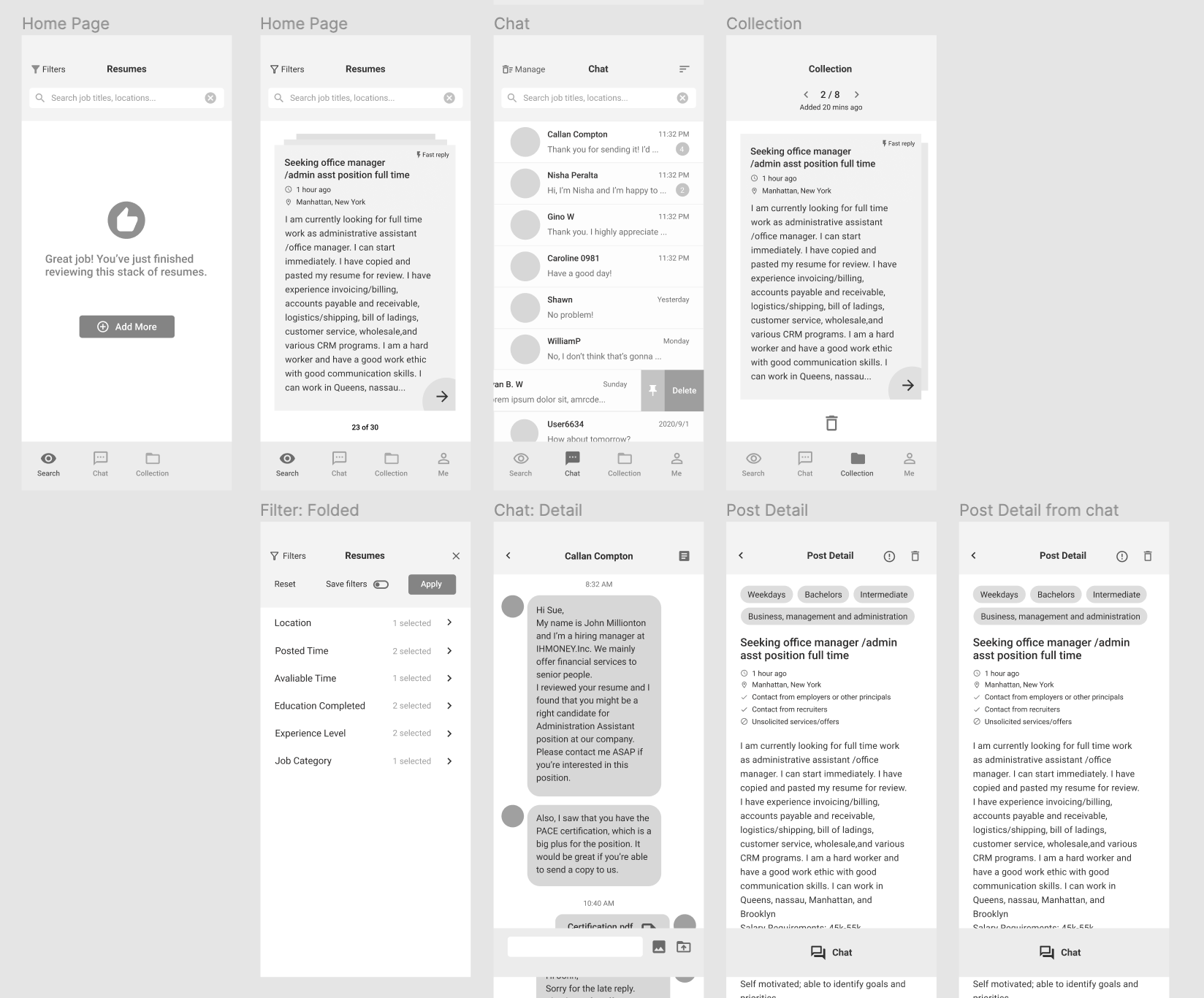
- The user has to go through a large amount of text, which made the searching process dull and time-consuming
- Lacking filters catagories for different job roles lowered the search efficiency
- The long scroll that included maximum of 120 results generated heavy workload
- The user interface didn’t help with the user experience
- More than half of the process happened outside the application

What is my solution?
Refresh the user experience
- Try to bring the physical experience with resumes into the digital design
- Make the process of searching more enjoyable
- Refined UI and workflow that leads to a lighter workload
Enhance search efficiency
- Add filter catagories for different roles
- Make the filter more accurate and organized
- Build in-app communication, no need to change platform

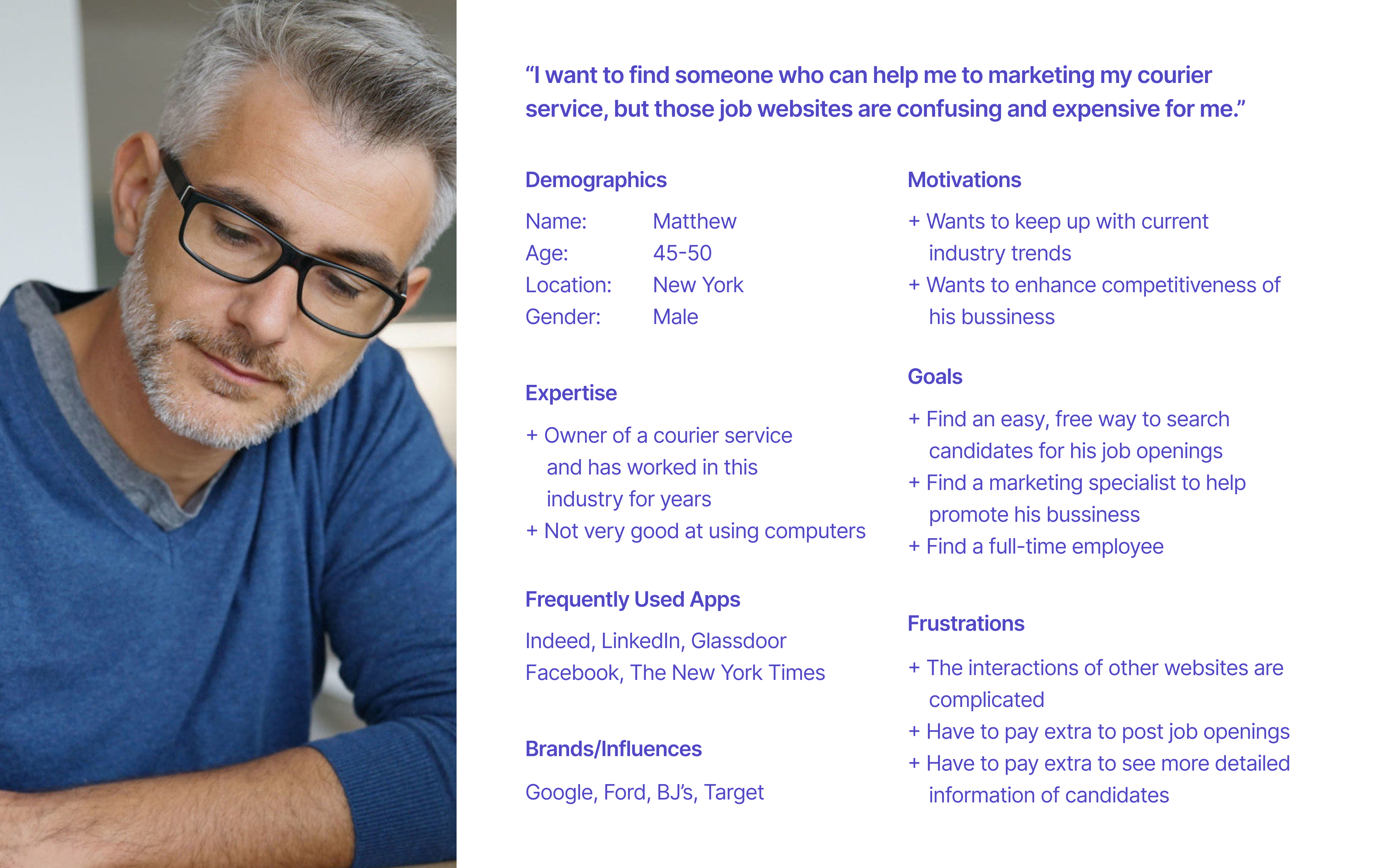
Who is it serving?
College graduates who are trying to find a full-time employment but tired of the process of filing endless applications and want to take the initiative.
Through interviewing college and graduates students and doing competitive product analysis, I’m trying to learn more about the frustrations and blockers they’ve encountered during the job searching process.
I found that they don’t like to:
- wait for a long time and not knowing you’re refused
- spend extra money on some job websites
- repeat the same process and finish complicated application procedures
Independent employers/Owners of small bussiness who are searching for candidates to fill specific roles.
Looking into the other side, I found that even though most job websites has various kind of sevices, these products are still more friendly to large companies, instead of individuals and owner of small bussiness who don’t want to cost too much in candidate searching. Meanwhile, the complicated interfaces and procedures are sometimes hard to figure out for those who are not good at using digital devices.
What are the goals?
Craigslist resume gives these students another option that allows them to post their desired position and resume, which reverse the process, let them take initiatives, and make decisions.
Craigslist resume offers simpler user interfaces and interactions. It reminds the user of the physical experience of viewing resumes. At the same time, it saves time by providing accurate filters that helps to narrow down search radius and locate ideal candidates. Through the in-app communication function, the employer can also be connected to the candidates easily.
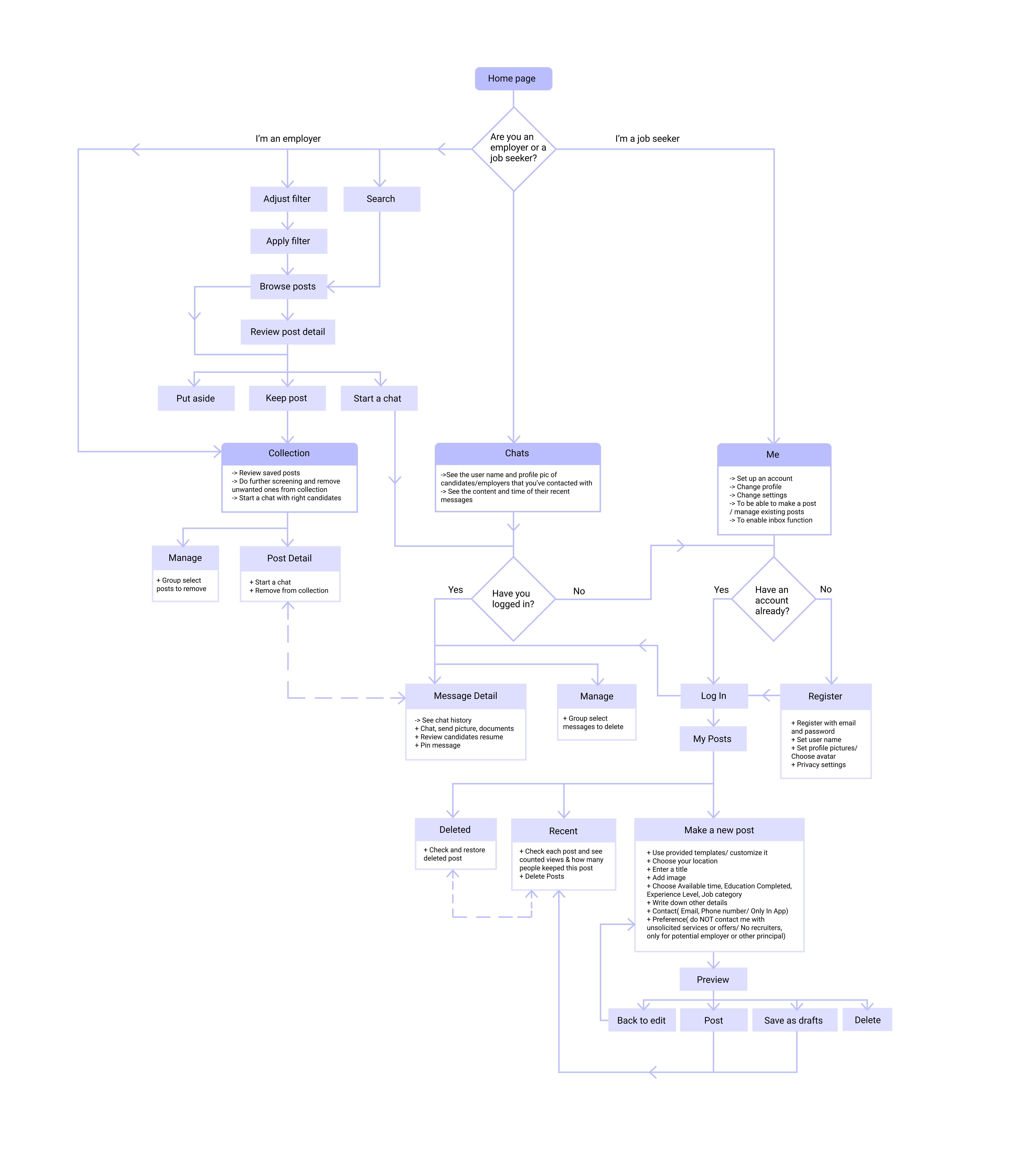
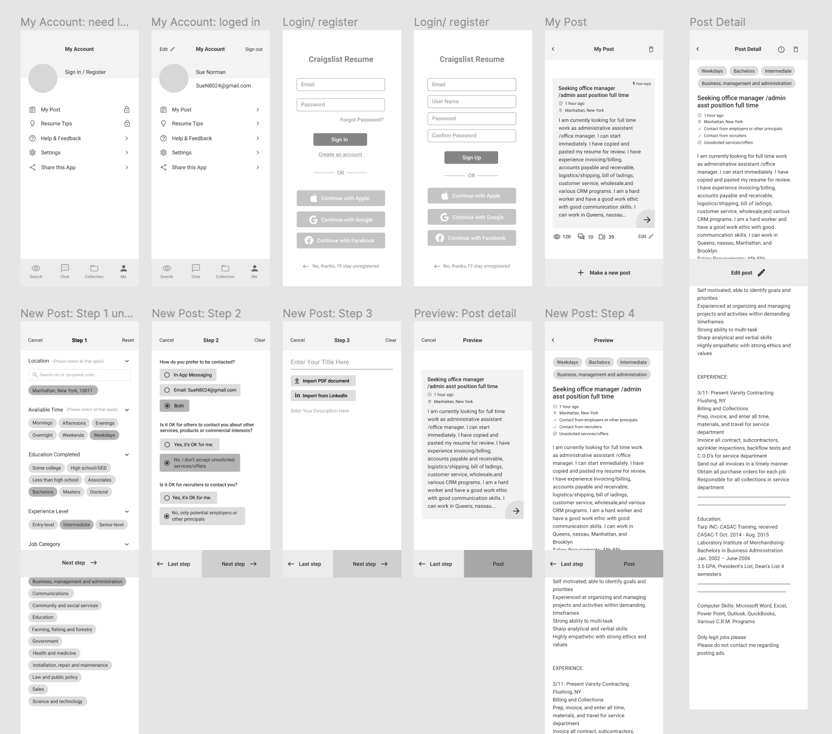
What are the design decisions I’ve made from wireframe to final product?
Highlight major call-to-action
In the wireframe and the user flow I put the new post function in my account page. But when clicking through the prototype as a student user, I realized that this is too hidden for a major call-to-action. It is better to put the new post function on the main nav so that the user won’t take an extra step to find it.
Stick to the priority
The steps of making a new post were also adjusted. Instead of choosing the filters first, I set entering the resume to the first step since the input of information is the priority for building a resume.