St.John’s Bay Brand Redesign
Role: Junior Designer at Asimov Collective
Before
The previous brand identity:
![]()
![]()
![]()
![]()
After
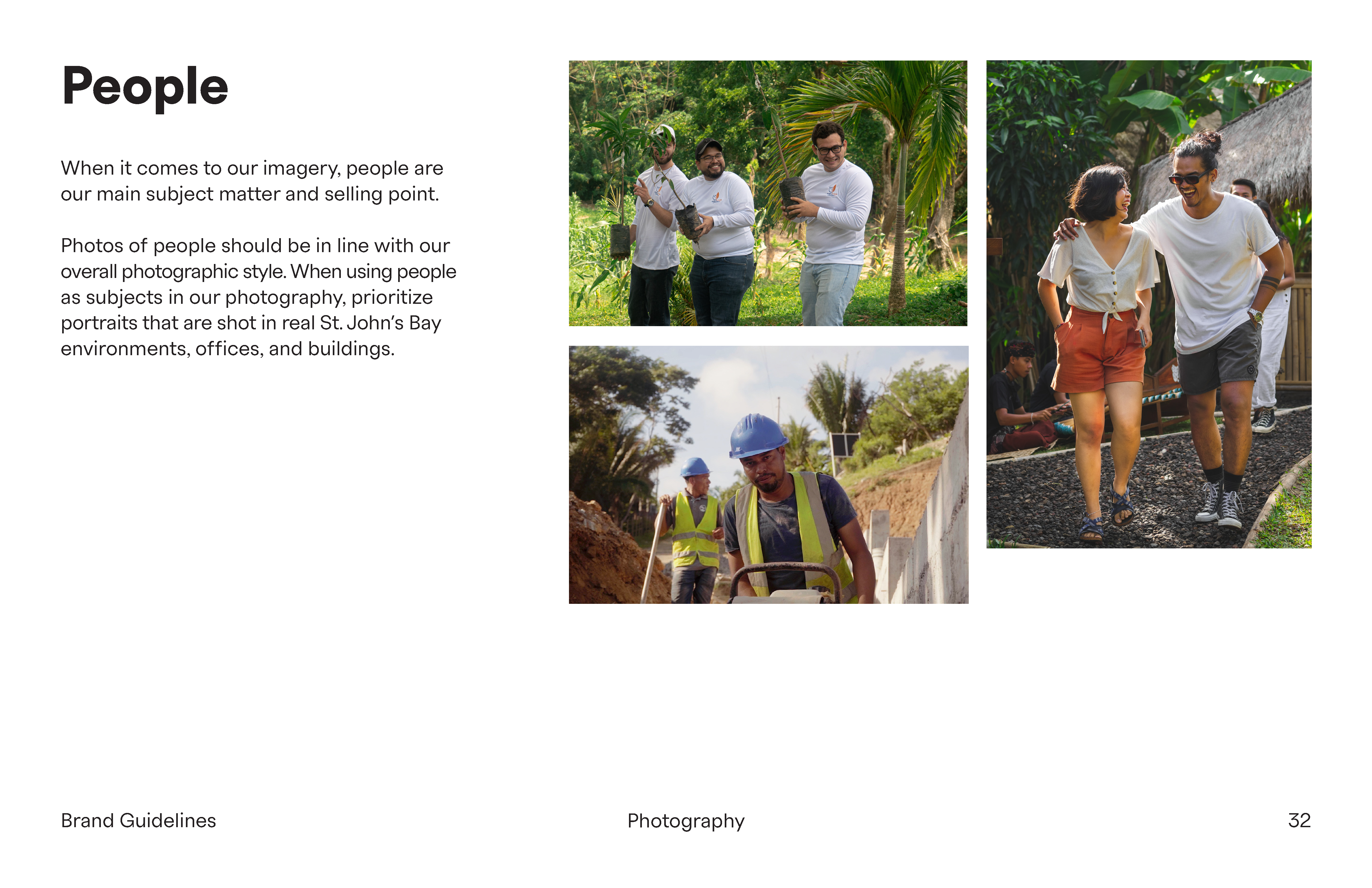
Selected Pages from Brand Guideline:
![]()
![]()
![]()
![]()
![]()
![]()
![]()
![]()
![]()
![]()
![]()
![]()
Example Usages:
![]()
![]()
![]()
![]()
![]()
Role: Junior Designer at Asimov Collective
- Adjusting brand voice through typography.
- Creating the Graphic systems and components.
- Redirecting the color strategy and photography styles.
Before
The previous brand identity:


- Feels outdated and not competitive
- Failed to represent the enormous economic potential growing at St.John’s Bay.
- Didn’t reflect the energetic, tropical nature of lifestyle at Carribean Region
- The graphic system was too static. Therefore it is lack of spaces for the identity to expand and stretch itself to other dimensions e.g. from print to web, from static graphics to motion.
After
Selected Pages from Brand Guideline:


Example Usages:


