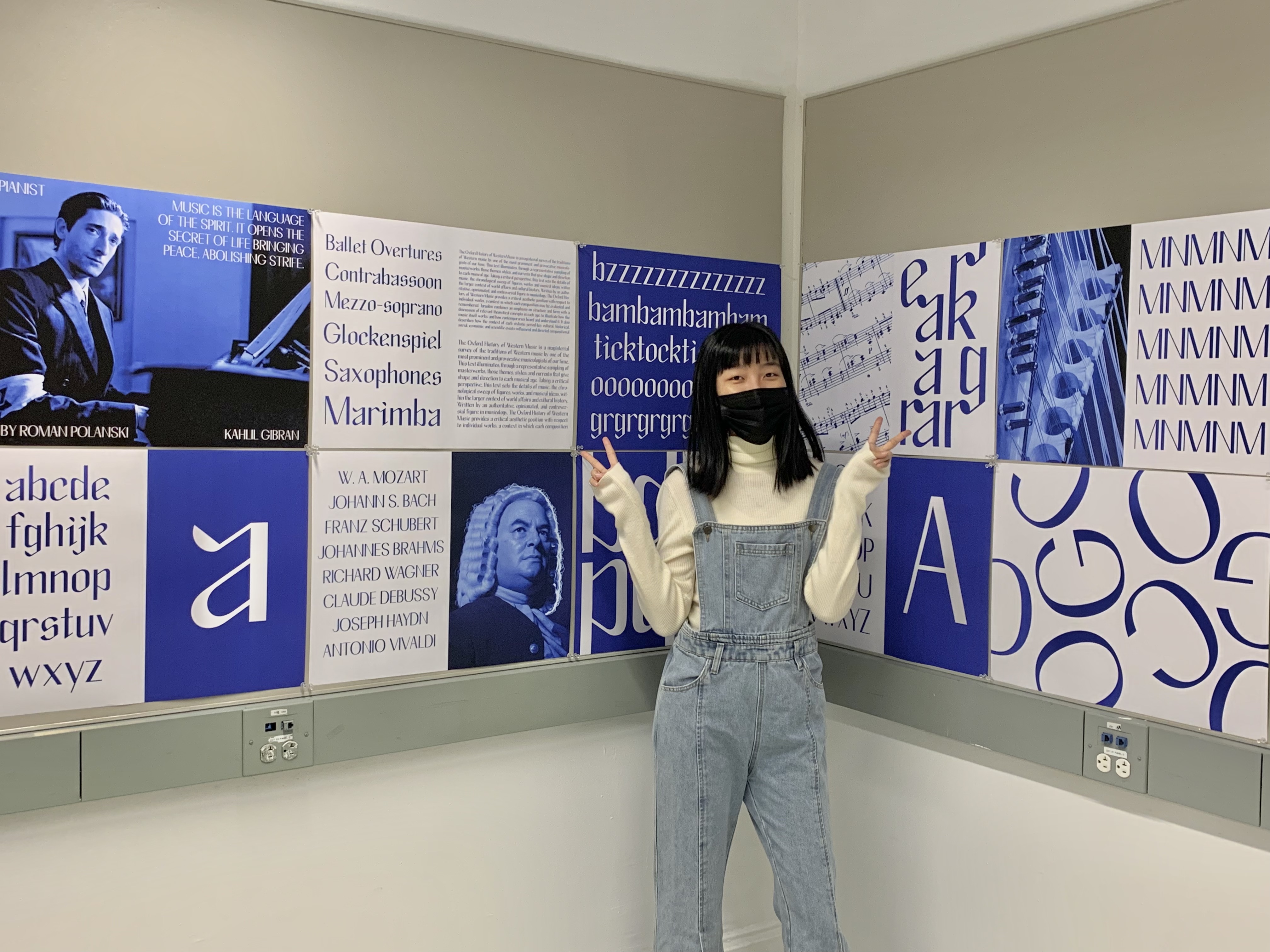
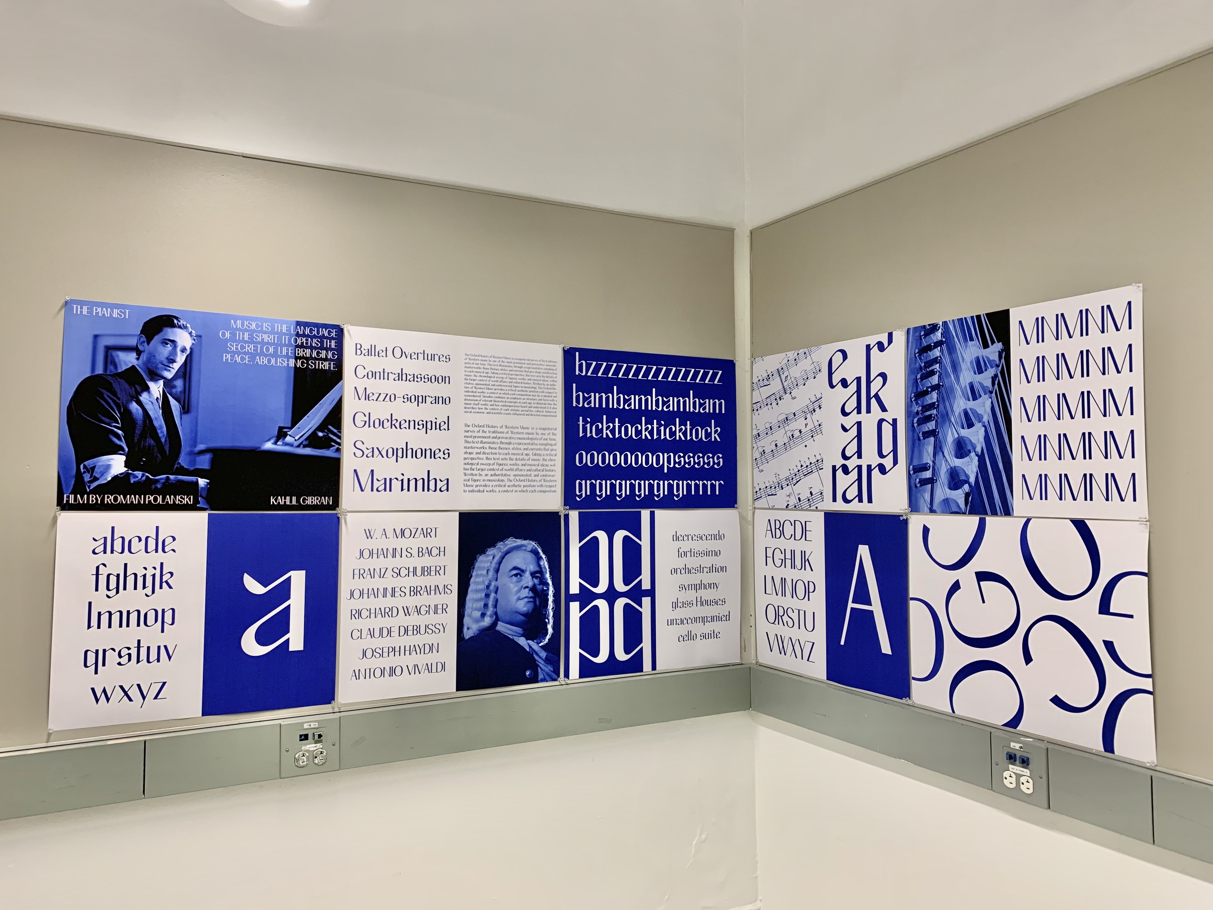
Rehearse Typeface
Typeface Design, Typography, Visual Hierarchy, Printed Matter
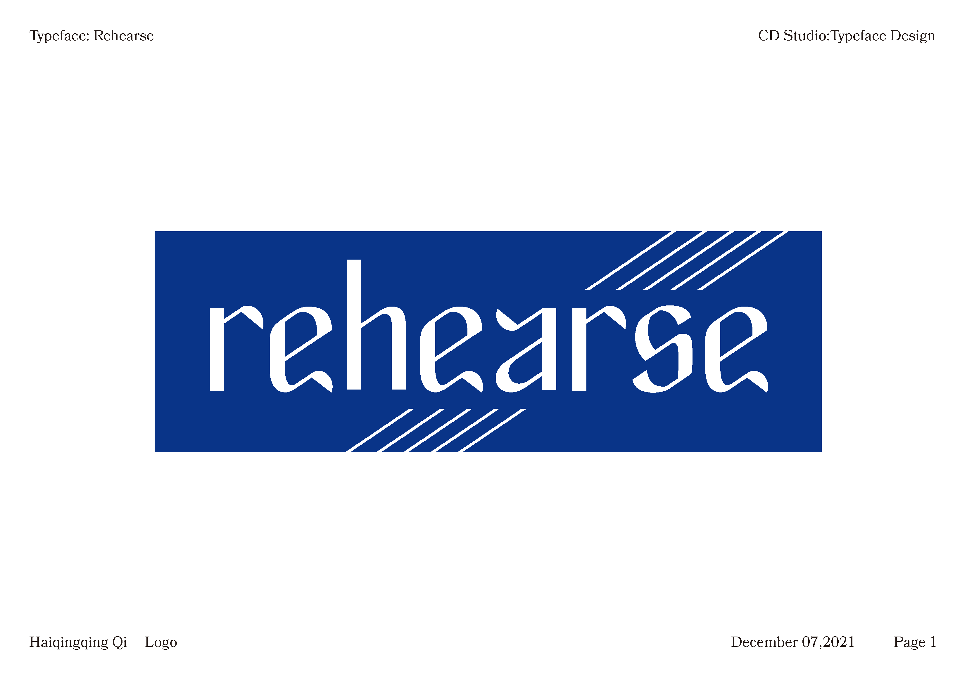
Rehearse typeface is a modern,elegant typeface that is great for theater events, performances and concerts etc. Its style can trace back to gothic typeface but with more modern, musical-related elements.
![]()
Typeface Design, Typography, Visual Hierarchy, Printed Matter
Rehearse typeface is a modern,elegant typeface that is great for theater events, performances and concerts etc. Its style can trace back to gothic typeface but with more modern, musical-related elements.
Inspiration and Sketches
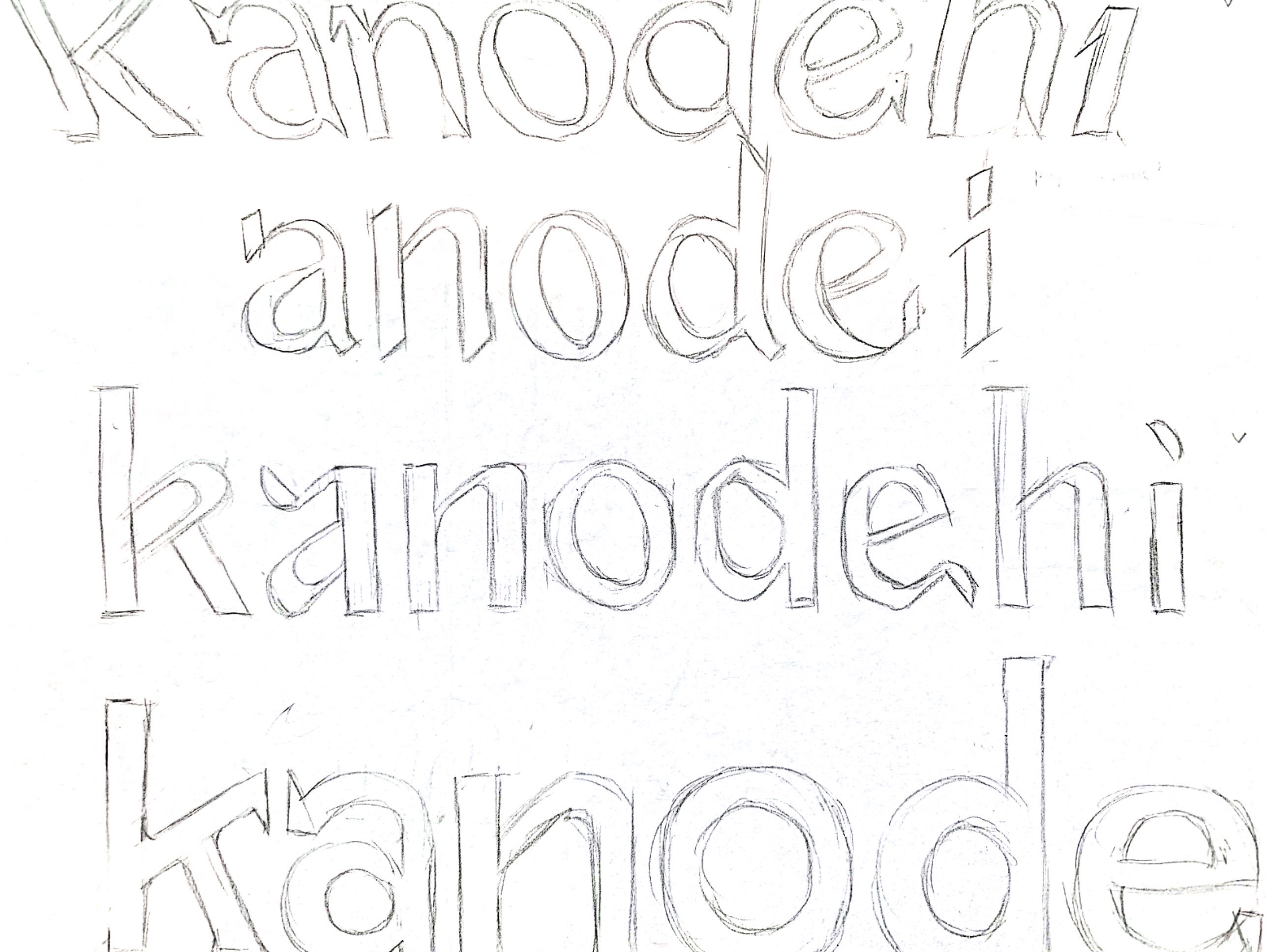
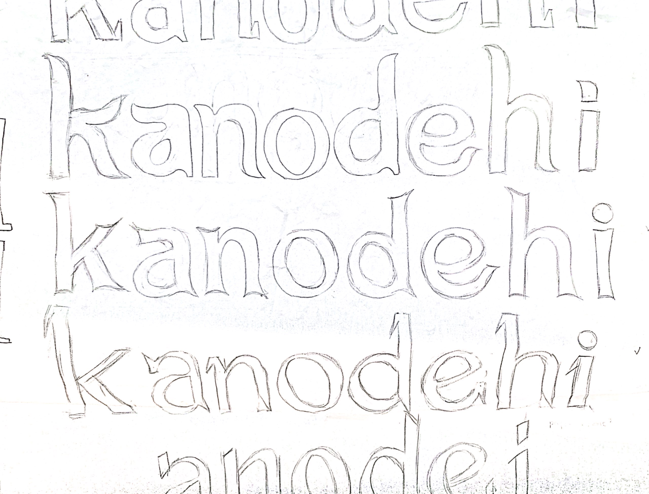
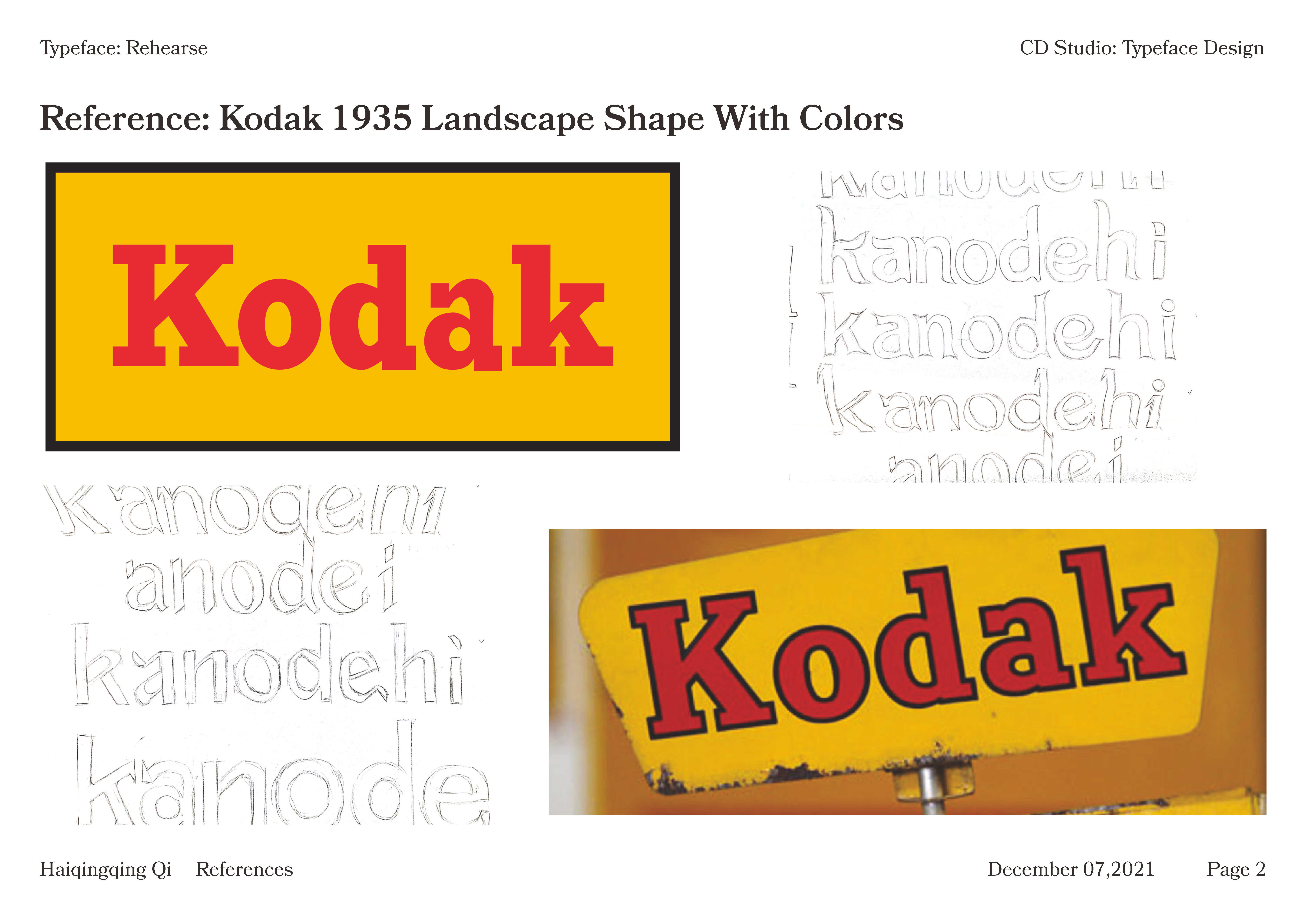
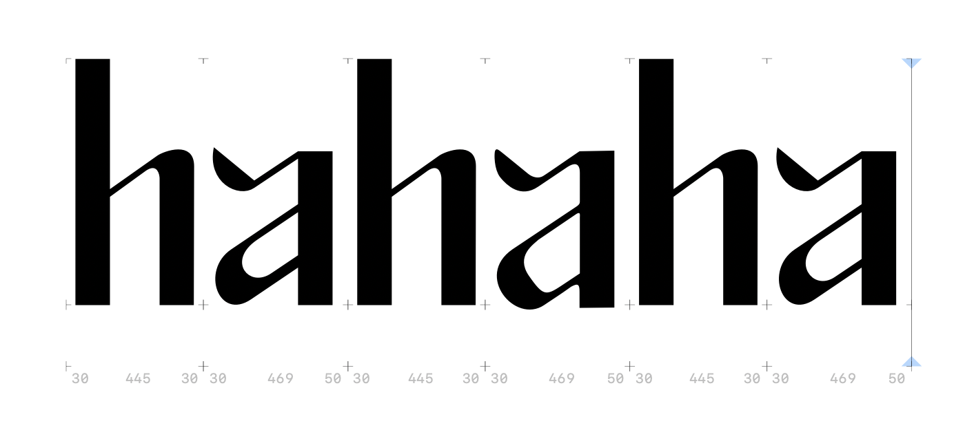
Looking at Kodak 1935 logo, the terminal of the “a” is very special compared to normal serif typeface. Inspired by the design of “a”, I made a few sketches using ANODE sequence and one of the variations reminded me of music notes. I’ve seen many typography posters and artworks that incorporated shape of music notes but what if I can make a typeface out of it?
![]()
![]()
![]() I first looked at caligraphy type for reference. Since this is the first time for me to design a typeface, I also referenced Lydian designed by Warren Chappell for American Type Founders in 1938 to add a sense of modernness.
I first looked at caligraphy type for reference. Since this is the first time for me to design a typeface, I also referenced Lydian designed by Warren Chappell for American Type Founders in 1938 to add a sense of modernness.
![]()
![]()
Process
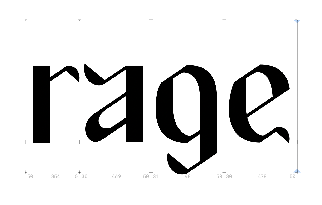
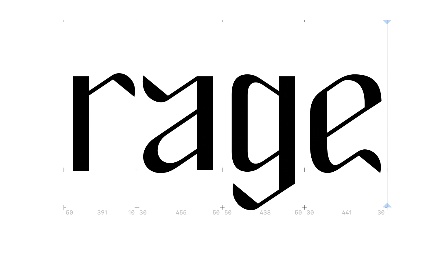
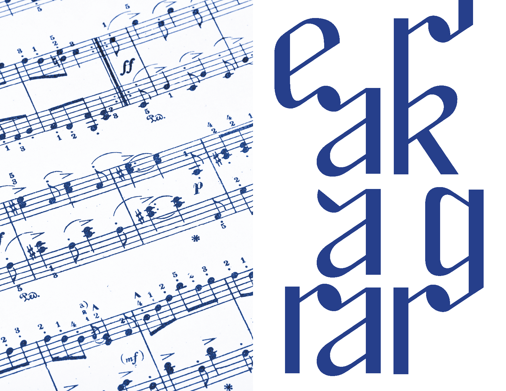
The slanted arcs, shoulders and apertures gave the typeface a rhythmical, dynamic feeling. In order for the music to flow, letters such as r, a, g, e, j has to be unified and the size, weight of their terminals were adjusted.
![]()
![]()
![]()
![]()
Looking at Kodak 1935 logo, the terminal of the “a” is very special compared to normal serif typeface. Inspired by the design of “a”, I made a few sketches using ANODE sequence and one of the variations reminded me of music notes. I’ve seen many typography posters and artworks that incorporated shape of music notes but what if I can make a typeface out of it?
 I first looked at caligraphy type for reference. Since this is the first time for me to design a typeface, I also referenced Lydian designed by Warren Chappell for American Type Founders in 1938 to add a sense of modernness.

Process
The slanted arcs, shoulders and apertures gave the typeface a rhythmical, dynamic feeling. In order for the music to flow, letters such as r, a, g, e, j has to be unified and the size, weight of their terminals were adjusted.

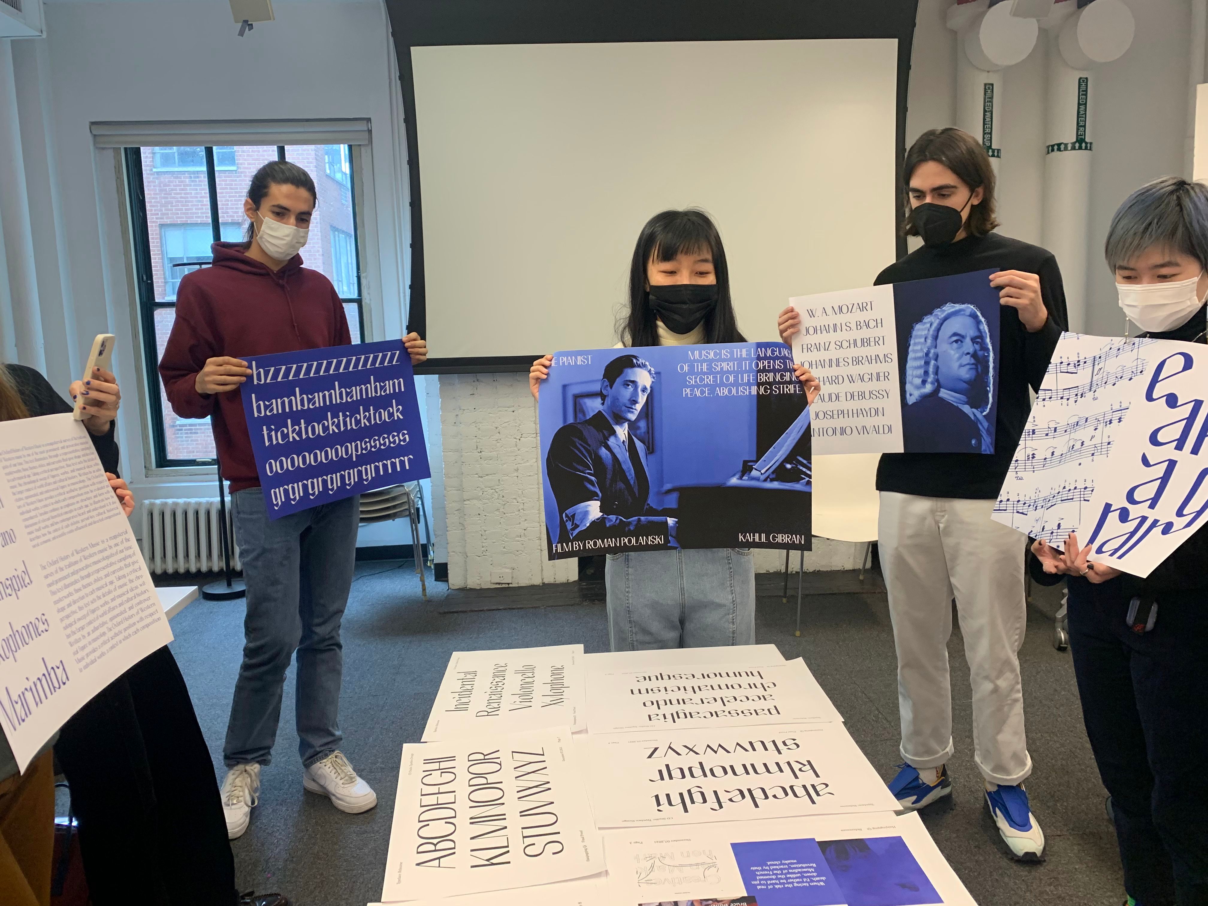
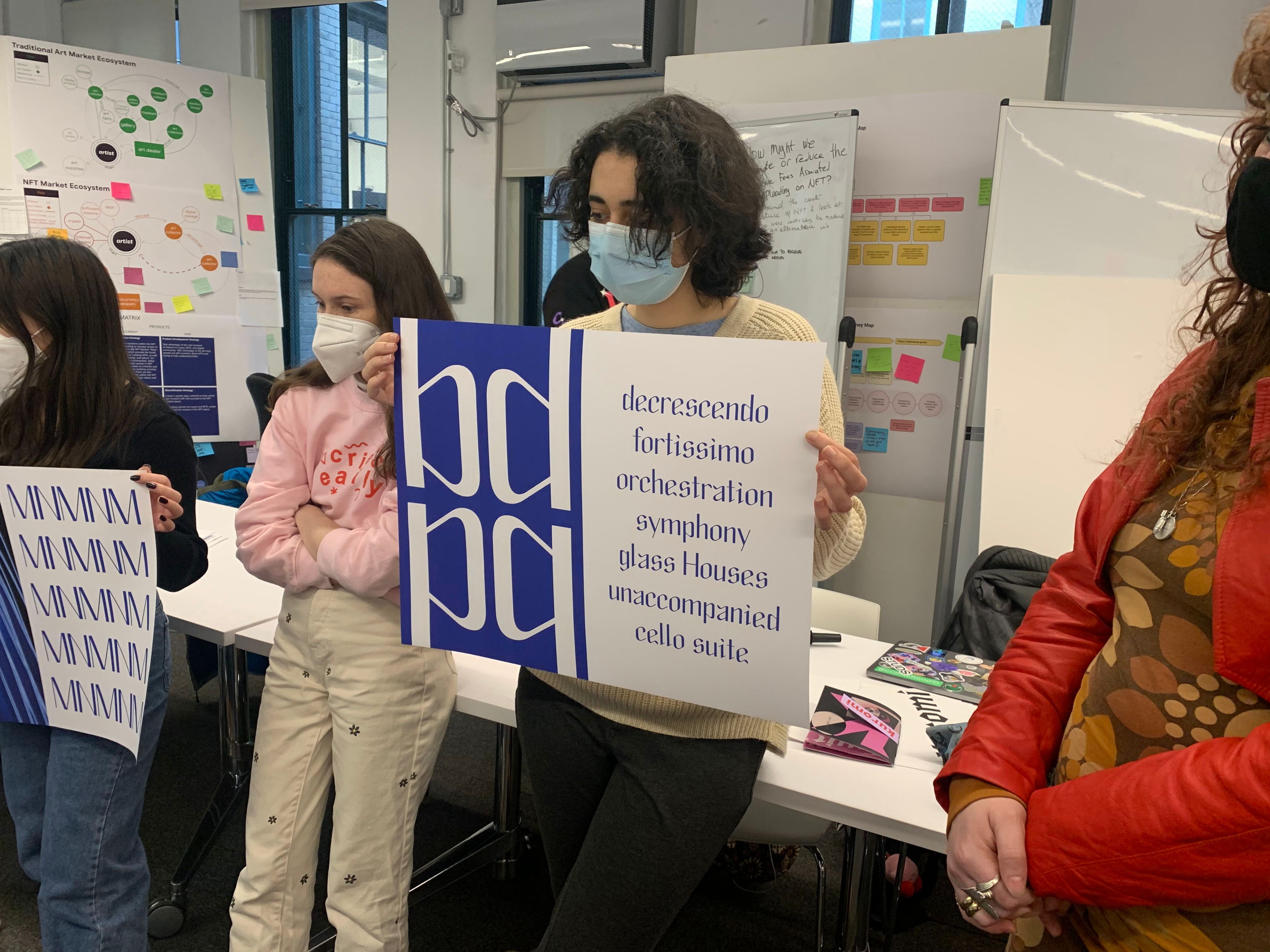
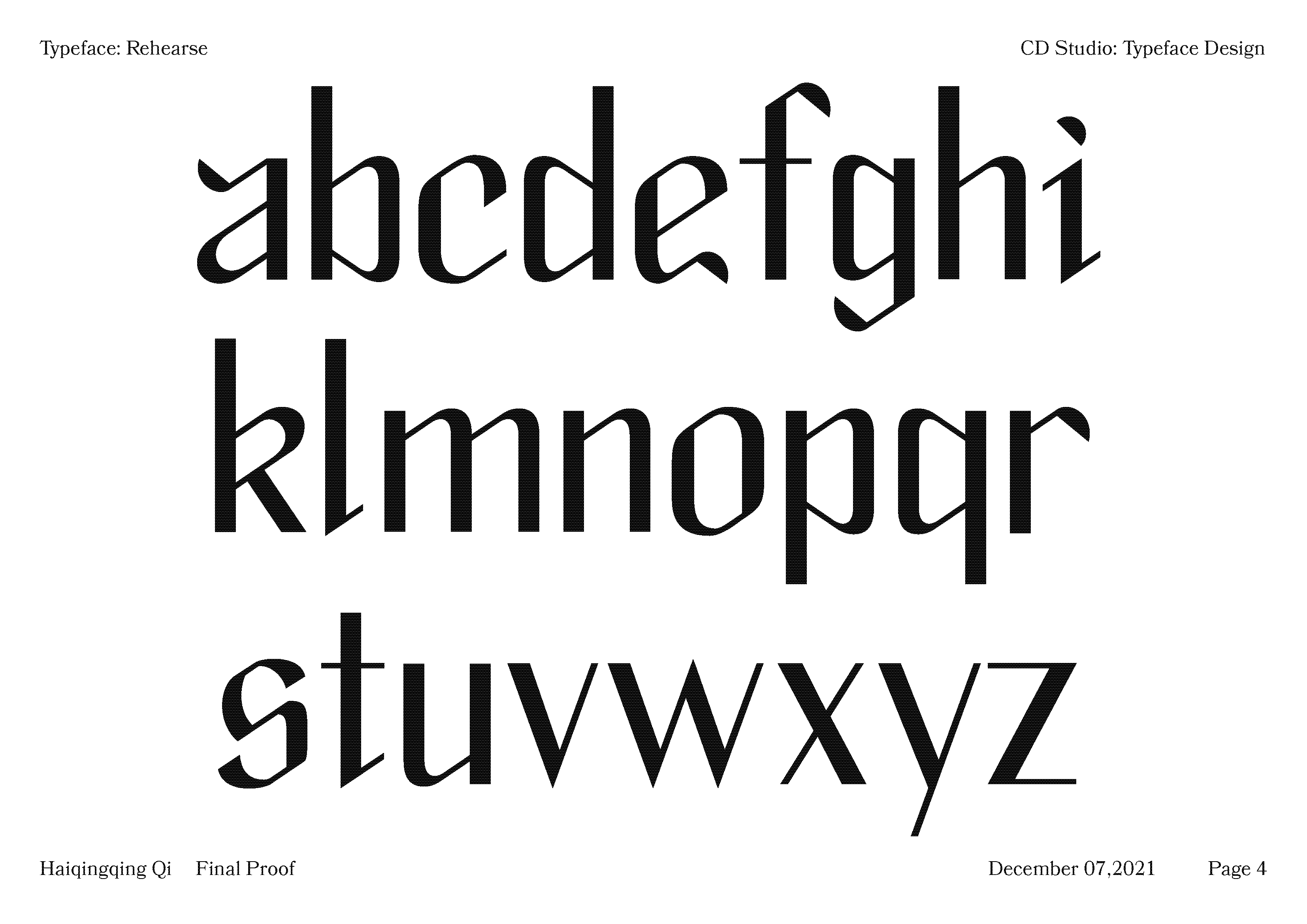
Proofs
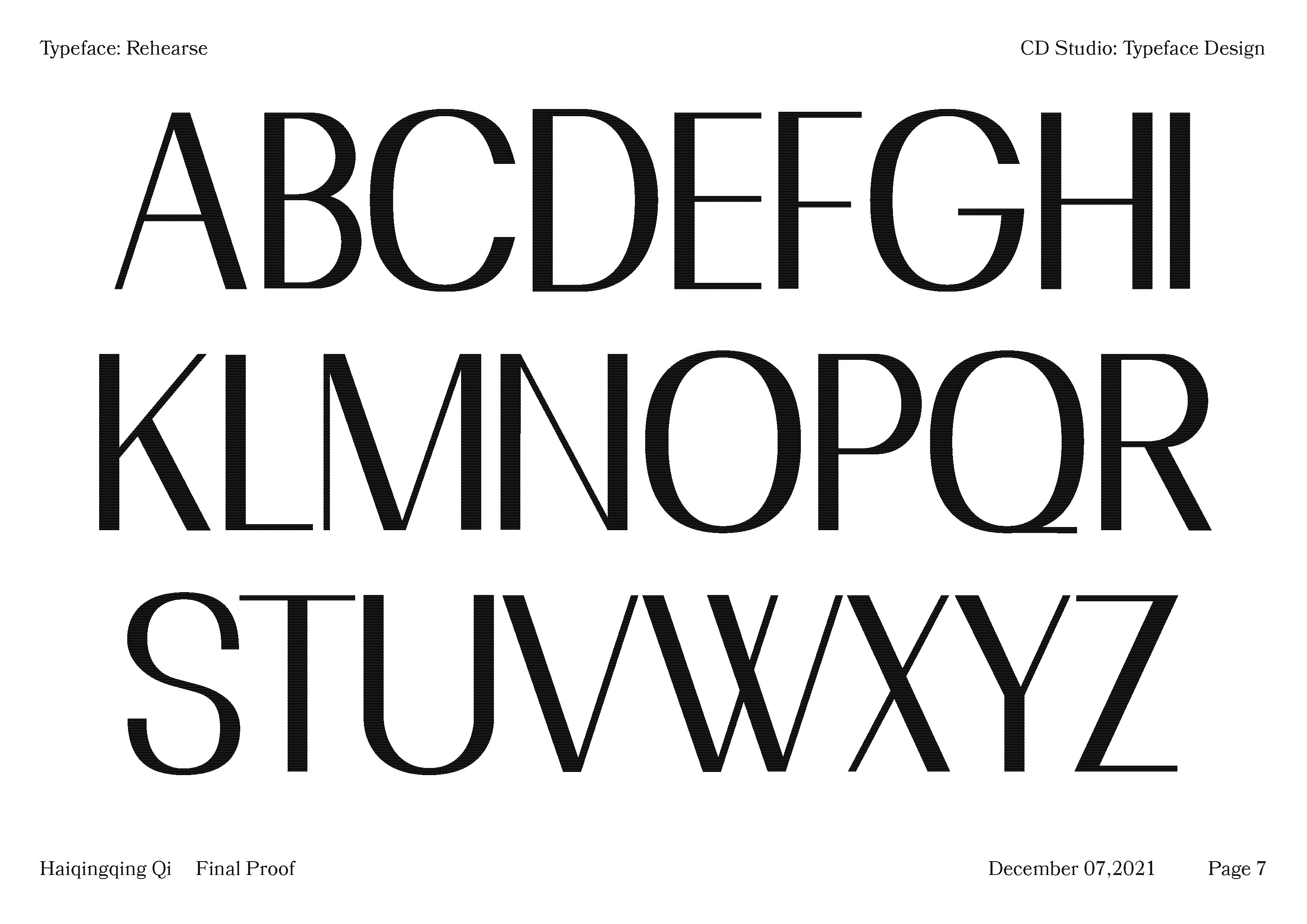
Proofs for both lower case and upper case letters.
![]()
![]()
![]()
![]()
![]()
![]()
Proofs for both lower case and upper case letters.
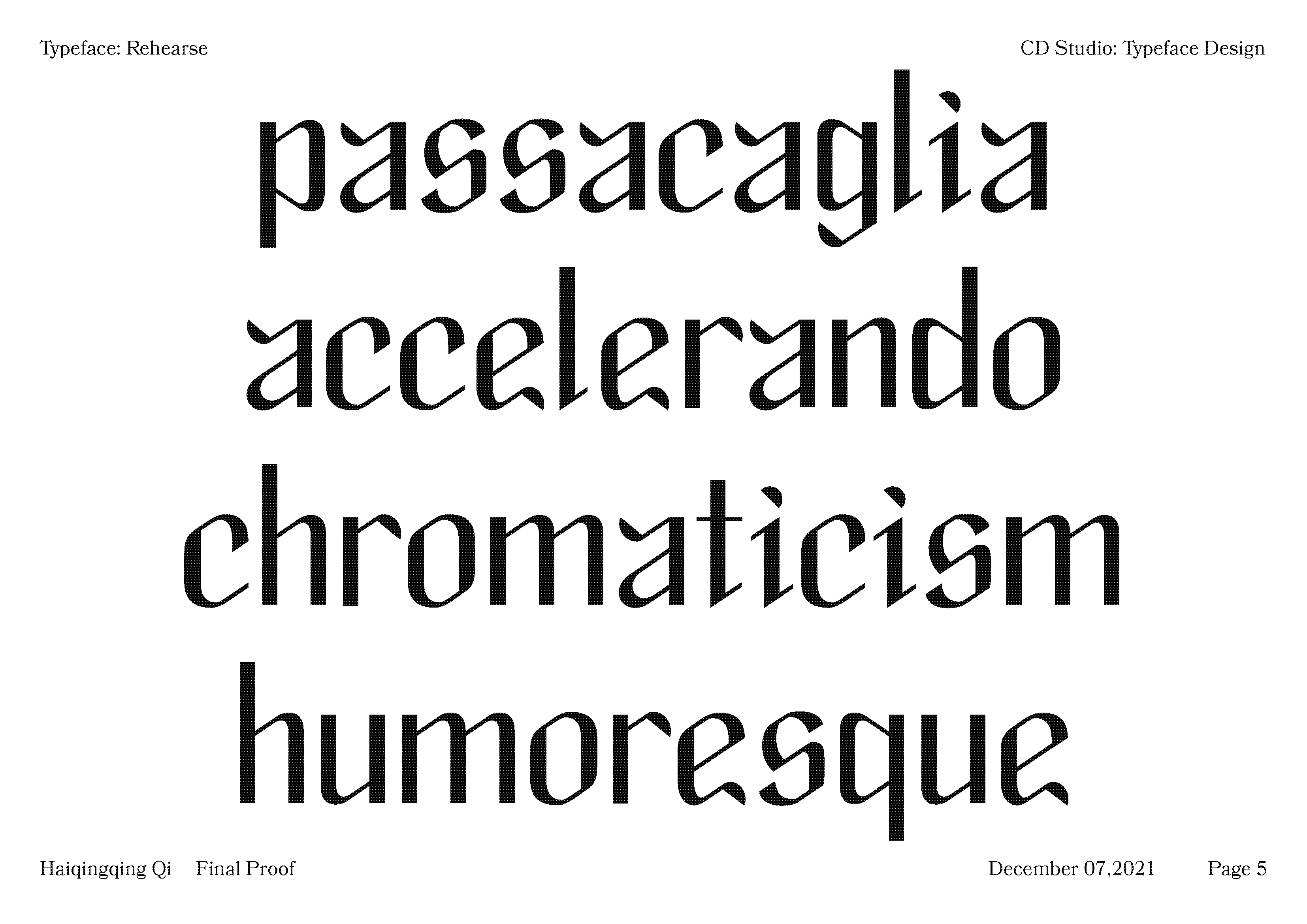
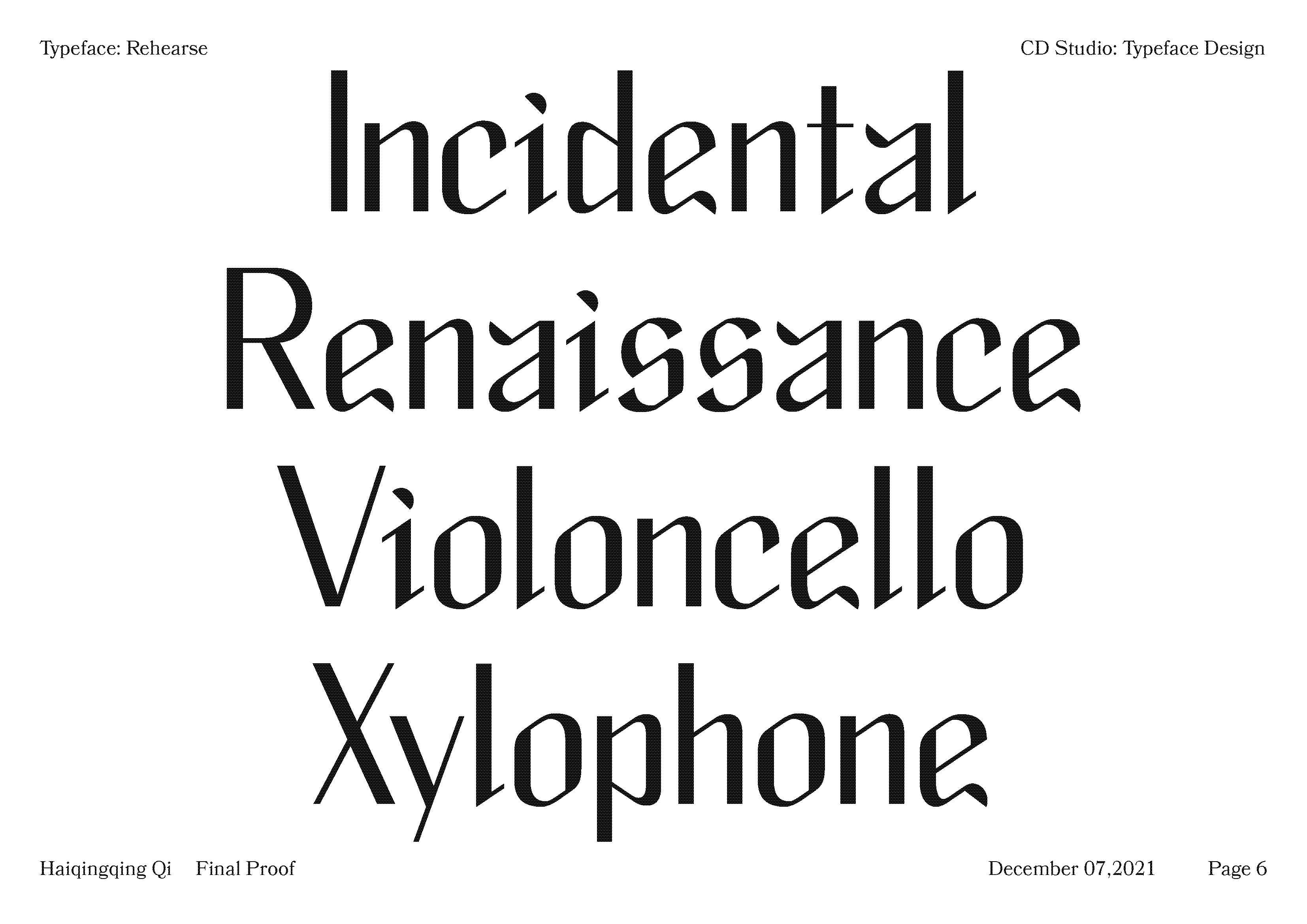
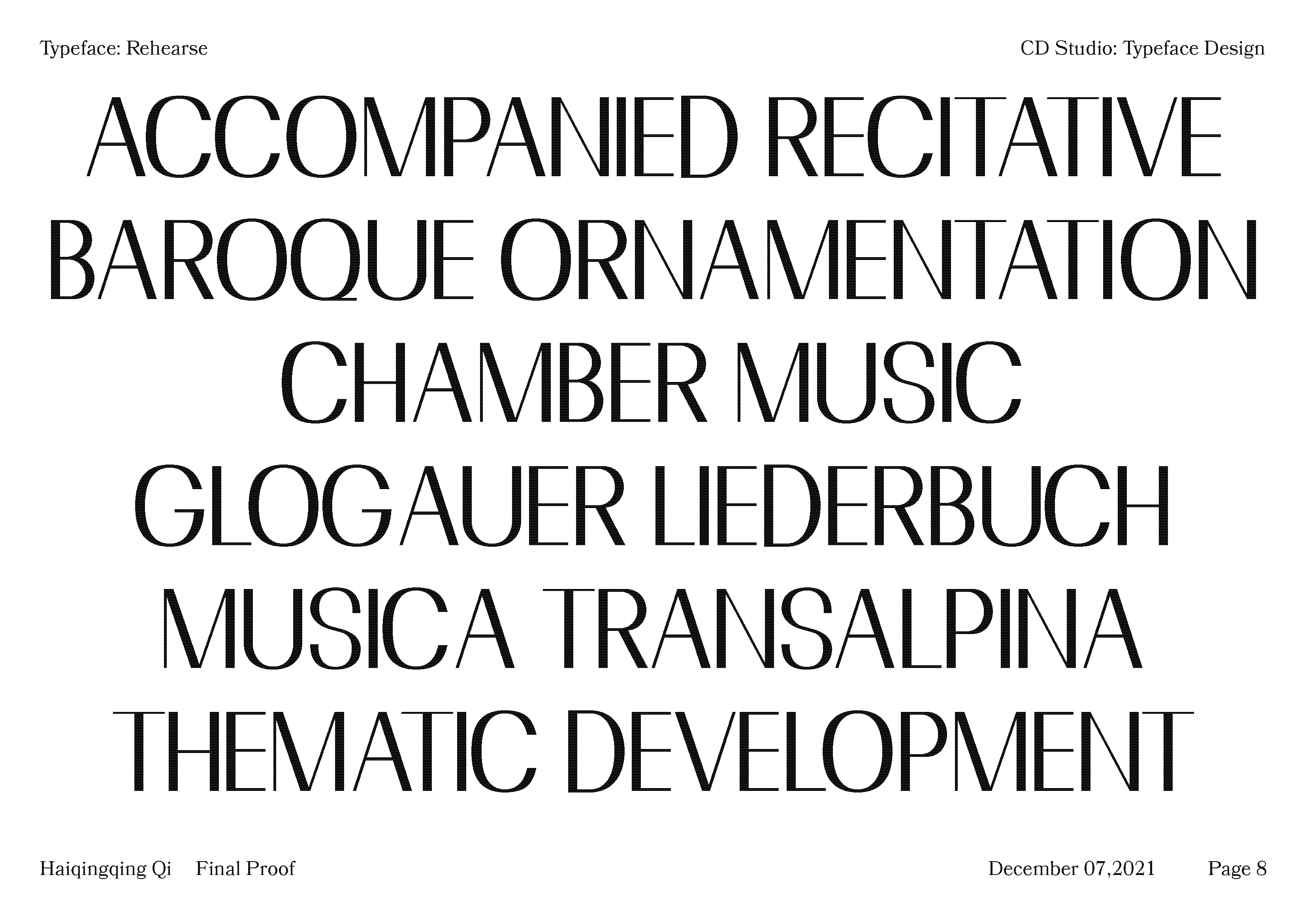

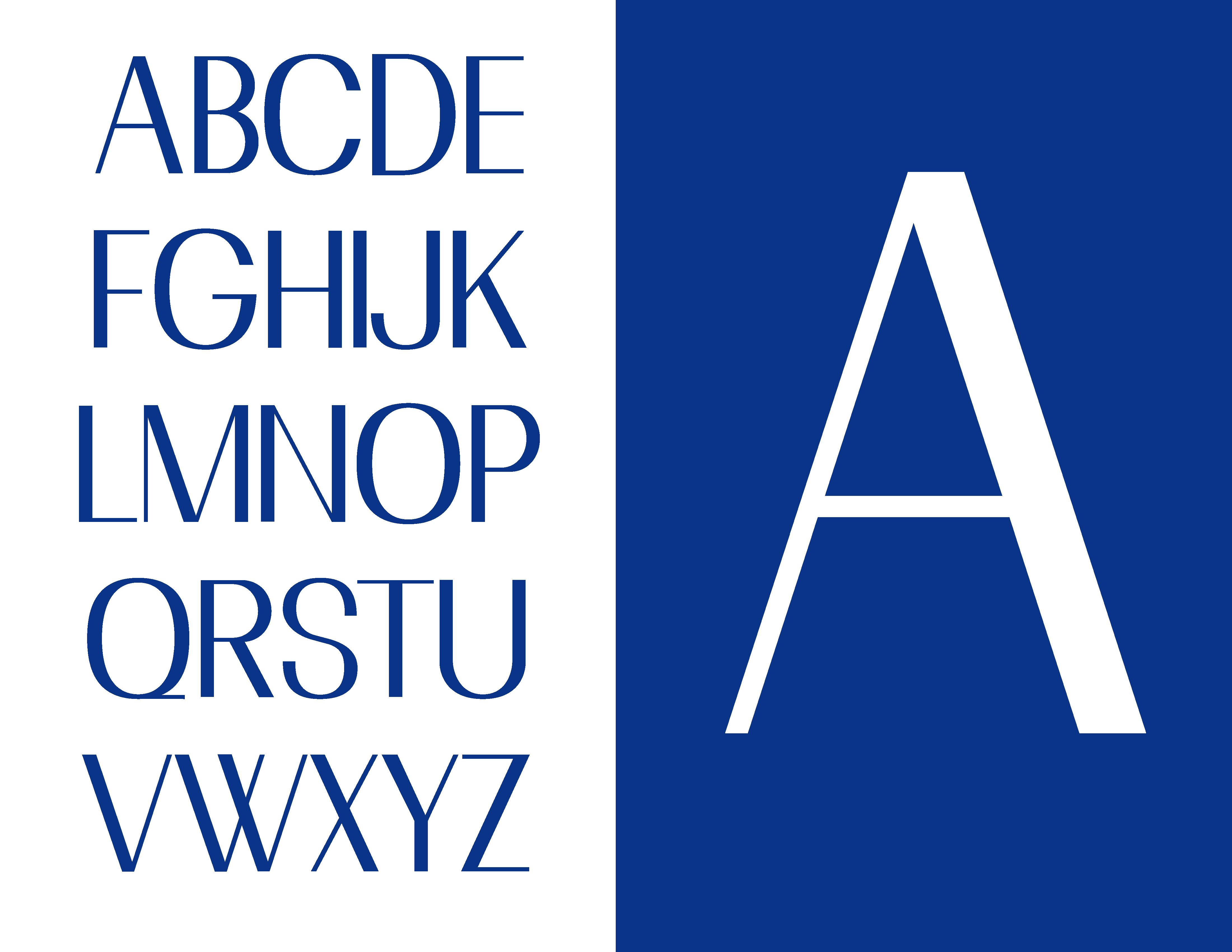
Specimen
![]()
![]()
![]()
![]()
![]()
![]()
![]()
![]()
![]()
![]()

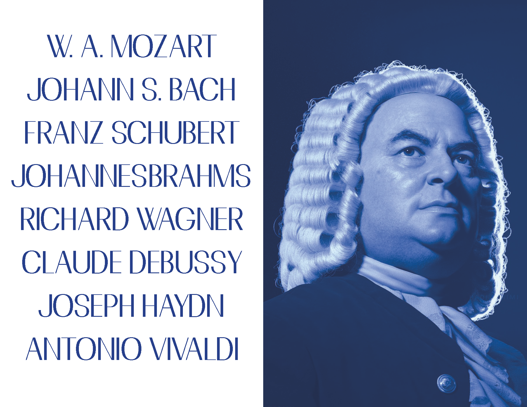


Presentations
![]()
![]()
![]()
![]()